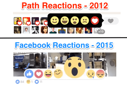
 In September, Facebook CEO Mark Zuckerberg made some waves when he hinted Facebook was working on a way to expand its famous Like button
— not by adding the much-fabled “dislike” option, but by making it way
more empathetic, expressing sadness and other emotions. Today, Facebook
is taking the wraps off what form the new Like may take.
In September, Facebook CEO Mark Zuckerberg made some waves when he hinted Facebook was working on a way to expand its famous Like button
— not by adding the much-fabled “dislike” option, but by making it way
more empathetic, expressing sadness and other emotions. Today, Facebook
is taking the wraps off what form the new Like may take.It is rolling out “Reactions,” a new set of six emoji that will sit alongside the original thumbs-up to let users quickly respond with love, laughter, happiness, shock, sadness and anger.

Facebook tells us that the pop-up feature will first start out as a test in two markets only, Spain and Ireland, before it decides whether to tweak it and/or how to roll it out further.
(The reason for those two countries? Adam Mosseri, Facebook’s director of product, says it’s because both have largely national user bases without extensive international friend networks, so they work better as closed test groups. Ireland is English speaking, while Spain lets Facebook test out how well the wordless emoji play with non-English users.)
Having more reactive set of emoji might sound familiar to you. In the wake of reports that Facebook was working on a “dislike” button in September, our own Josh Constine predicted that Facebook might instead offer a small selection of emoji, similar to the reaction buttons Path offered back in 2012. It turned out that Facebook had even filed a patent for how such an emoji response feature might work and look. (Those pointers appeared to be spot-on.)

More generally, a small set of reactive emoji is definitely a familiar interface for online users: social networks like Path and sites like Buzzfeed already give users the ability to respond to posts with different reactions beyond simple likes and faves.
 The
new set of reactions will appear across both mobile and desktop
versions of the app and on all posts in the News Feed — be they from
friends, Pages/accounts you follow, or advertisers.
The
new set of reactions will appear across both mobile and desktop
versions of the app and on all posts in the News Feed — be they from
friends, Pages/accounts you follow, or advertisers.At this point, there are no plans to put them into Messenger or other Facebook-owned products, Mosseri tells me. (Although you could see how this would make a lot of sense in a product like Instagram, too, for example.)
The reactions will work simply enough. On mobile, the emoji will come up when you touch the like button on your screen; on desktop they will come up as you hover the mouse over the like or click on it.
Facebook’s move to add in the emoji come from a few different challenges and trends that the social network was noticing.
First, there was the basic demand that users were making
of Facebook to provide more than just a simple like. Sometimes a
thumbs-up simply isn’t the quick response that you are looking for, if
the news in question is shocking in a bad way for example.
Mobile is increasingly the default platform for more and more Facebook users, so the fact that some people don’t like to spend time tapping out responses on mobile handsets is an important thing to address for a social network that very much relies on user engagement to work as a business.
Mosseri says that some people were already using Stickers as a wordless way of registering their responses, but this will give them a quicker way to do this.
“Typing on mobile is difficult,” Mosseri says, “and this is way easier than finding a sticker or emoji to respond to in the feed.”
Offering different emoji will also mean that Facebook will start to tally and show those different responses: so, just as today you see how many people and who Liked a post, now you will see which people loved it, or found it surprising, or sad, and so on.
For Page owners and publishers, this data collection will also eventually make its way to Facebook’s analytics dashboard. So, just as today social media managers can monitor shares and likes of certain posts, they will be able to now get more granular data about how people are emotionally responding to content on the social network, which should also help Facebook in its bigger play for selling advertising and simply getting more relevant content to users.
Mosseri says that just as with the Like
button or with comments overall, once these do come to your feed, you
will be stuck with them — no option to turn off responses as publishers
sometimes do with comments on articles in websites. Giving users the
option to turn off the emoji was “somethng we
considered”, Mosseri said, but they decided against it. “If you think
about the user experience first, that option could become confusing,
with people thinking something was broken instead.”
